Terrible statistical writing: NatGeo Global Warming Article

I find it really hard to inform myself on certain issues when the mathematical arguments presented in articles just make no sense.

I was reading this recent article by national geographic called “does the ‘global warming pause’ debate miss big picture”

It starts out by stating that there’s been a decrease in the rate of global warming in the 21st century, but cautions readers that this doesn’t mean global warming has stopped.  So far, so good - I understand what argument is going to be presented.

Then it links to a research paper that that says the slowdown in global warming is caused by the el nino cycle in the Pacific.  I can’t speak to this analysis since I don’t know enough climate science, and I don’t have the actual data to analyze.  But at this point, I’m still happy with the article, I think their point is very clear.

Okay - now a little bit further down we get a quote from Gavin Schmidt at NASA.  He doesn’t read too much into the pause, and says “If you take 1998 out, there is no pause”

Wait a minute!! I hope I’m not alone here - I think anyone who analyses data should start to get a worried here.

First of all, if that were true, any analyst who says they saw a global warming pause is not doing their job.  If you see a pattern, and taking away one data point removes the pattern, your model is not robust enough to be trusted.

Secondly, this totally contradicts what’s been said earlier in the article.  Just in the last paragraph, we are told “there’s no denying that temperature has plateaued in the last decade” (which doesn’t include 1998).  And in the paper about el nino that they posted, the abstract starts by stating, “the annual-mean global temperature has not risen in the twenty-first century”.

So either those two sources are wrong, or Schmidt’s quote is wrong.  But the article continues along as if nothing is amiss.

Then in order to support Schmidt’s claim: “the ten hottest years since 1880 have all happened since 1998, with 2010 being the hottest of all” But the argument is that the rate of global warming in the 21st century has dramatically slowed, not that it’s cooling.  So of course we’d expect recent years to be warmer. Doesn’t make Schmidt’s case at all - they’re confusing the first derivative with the value.  Even if the derivative went to zero (an “exact” pause in the global temperature) - sounds like the data may be consistent with that.

Anyway, maybe I should do something else on a Sunday night.  Anyone see Breaking Bad? I still have to catch up.
DataGotham 2013 Talk, or Japanese vs Russian reviews

/I gave a talk recently at DataGotham (http://www.youtube.com/watch?v=1KfK0zOSo5U), and I’ve gotten a lot of questions about one particular/tr stat that I gave in that talk.  If you write a tip in Russian, then you’re 3 times as likely to hate the place than if you write it in Japanese.  Where does that come from?

Well, I don’t mean that the same person is going necessarily going to come to the same conclusion just by switching language - although that would be a neat experiment to run.  What we did was first categorize our Foursquare tips by language, and for each tip we looked at people who liked and disliked the venue.  This wasn’t done by language and not country, because for sentiment analysis we build a different model for each language (a negative english tip is a negative english tip anywhere).

It should also be pointed out that we’ve ignored tips that are written without an explicit review (even though we still do sentiment analysis on those).  This ratio is simply negatives / (negatives + positives).

So it turns out that there’s a correlation between language and the type of review received by the venue.  The reason for this is purely speculative, but some have suggested cultural differences.  I’m open to hearing other hypotheses.

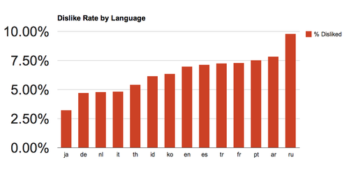
A few things to note: the data is overwhelmingly positive.  Even Russian speakers are over 90% positive.  Japanese and Russian are the two outliers among the languages we considered that really stuck out.  The rest of the languages kind of bunched up in the middle.

Here’s a graph with all the languages I considered (some data had to be cut down for the data gotham slide).  The 2-letter languages codes are from 

image

Here are the actual percentages:

japanese 3.25%
german 4.72%
dutch 4.79%
italian 4.84%
thai 5.44%
indonesian 6.16%
korean 6.37%
english 6.98%
spanish 7.14%
turkish 7.27%
french 7.31%
portuguese 7.55%
arabic 7.84%
russian 9.81%

Foursquare’s recent Tumblr post on the issue

Casino Random Number Generator

Here’s how it works: the outcome of each round of the game is either 0 or 1.  Before the outcome is decided, players place bets on either side.  The total amounts bet on each side are confidential.

After betting is closed, the outcome is calculated as the one with the least amount bet on it.  The losers get nothing, the winners double their money, and the casino takes the rest. For example, if there is $100 bet on 0 and $120 bet on 1, the outcome would be 0, there’d be $200 in payouts, and $20 to the house.

Any conceivable pattern in the outcomes will be obliterated, and expectations by the players will become self-defeating prophesies.  In other words, if we could get people to play this game, the outcomes would be about as random as you can get.

Would this work?  What are the flaws?